
The press release for Country Music begins with a personal anecdote relayed to us by Jeff Poe, curator of the show and co-owner of the gallery. Poe tells us of one of his “first memories of becoming aware that art and life and emotion are a tangled web,” by describing a series of handprints that his grandmother, whom he remembers as “just pure love,” left on her stairwell wall. This inadvertent handprint abstraction, an intricate and layered pattern made through years of repeated rubbing, provided him with a formative aesthetic experience. He goes on to tell us that the artist Freddy Kunath gave him an iPod’s worth of songs, many of them under the genre of country music, including simple songs about “Love. Loss. Longing. Happiness. Regret. Hopelessness.” Through this disarming press release (and that’s what it is, honesty serving to win us over), and before even entering the exhibition, we know that the curator has great affection for his grandma, likes straightforward songs about heartache and pain, enjoys a close friendship with one
of the artists in the exhibition, and has put together a show about “pure emotion.” We also know that he wants us to know this, that his display of sentiment serves a purpose to endear himself to us. Nevertheless, I found the wonderful pleasures of old-time music and grandma’s cookies to be a refreshing change from so many cookie-cutter press releases.
So I begin my consideration of this exhibition by wondering not only if I am being manipulated, which seems to be clear, but also that perhaps the power to manipulate lies not with the author of the sentiment, but with honest sentiment itself? And more importantly, if manipulation is at work here, should I table my cynicism, put my trust in another, and let myself be affected?
But first a disclaimer. This show opened two days after my birthday, which I spent feeling alone after a painful break-up, listening to old folk blues (which is perhaps the original country music). Regret, longing, and a sense of loss were feeling all too familiar. Hope was recognizable, but still very far away.
Mississippi John Hurt’s lyrics were a muddle in my mind when I first entered the gallery. Written in the 1930s, they nevertheless seemed to be about me:
“Yes, whiskey straight will drive the blues away,
that be the case, I want a quart today.”
And,
“Say, baby, did you get that letter?”
If you take me back I’ll treat you better.”
And,
“I’m goin’, I’m goin’, cryin’ won’t make me stay,
more you cry, the further you drive me away.”
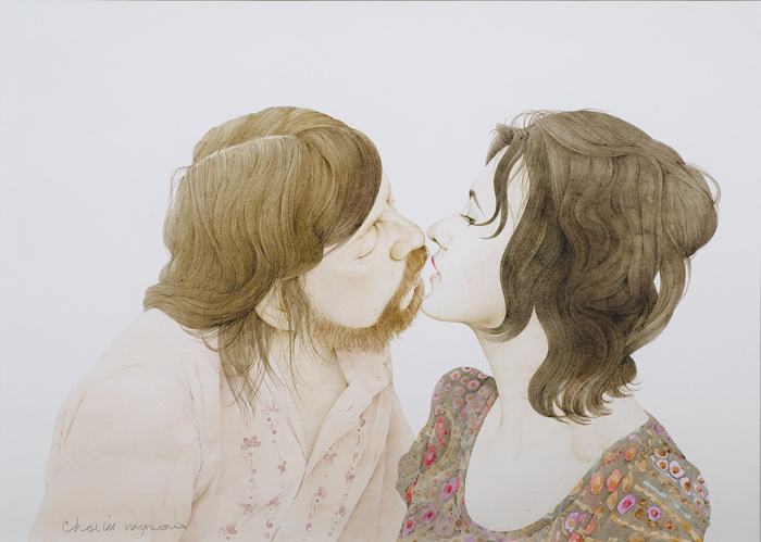
Charles Raymond, The Joy of Sex, detail #1, 1972. Colored pencil and gouache on paper, 15 parts total, 16 x 20 in. each, framed. Photo: Robert Wedemeyer.
As there was neither joy nor much lovemaking in these lyrics, it was perhaps an inauspicious soundtrack for Charles Raymond’s meticulous illustrations for The Joy of Sex (made in 1972). This was my first in-person viewing of the drawings, although I was familiar with them because I bought the book at age seventeen, as a newly minted non-virgin, for judicious study. The installation separates the illustrations into two sets, split between the first and last rooms of the gallery, such that Raymond’s drawings serve as introduction and coda to the rest of the show. Executed in colored pencil and wash, the small drawings depict the artist and his wife engaged in various acts of lovemaking. Raymond’s line is confident and studied; his gentle touch with the pencil is mirrored in the limbs of the lovers, who touch one another assuredly yet delicately. These drawings are striking in their tenderness, especially as compared with contemporary pornographic imagery, which is, for the most part, the only place you see people engaged in sex outside your own bedroom. Here the positions are achievable to your “average” love maker: bodies are presented as they are, with hair where it should be, and penises and breasts at reality’s scale. These drawings, without irony or a higher goal, are simply a straightforward depiction of the artist and his lover—and shared with us.
The bookend placement of Raymond’s tender drawings serve to charm me on arrival, dislodging my cynicism and warming my heart, and on my way out they “suggest” to me, rather deliberately, that the show I just saw was irony-free. Moreover, splitting the drawings into two sets challenges the notion that lovemaking proceeds in stages, from foreplay, to a few set positions, through to climax. The Joy of Sex, one might recall, is guided by the metaphor of a meal. (The “Joy” in its title is a reference to the bestselling Joy of Cooking.) The sexual act is divided into appetizer, main course, and dessert. In their original context in this seminal book, these drawings played a part in the sixties sexual revolution’s expansion in the seventies with some controversy, for open talk about sex in popular discourse was a new, and for many unwanted, development. Here, because the images that represent the “beginning” of sex and those that represent the “end” are separated into different rooms arranged as points on a circle—one always returning you to the other—–there is the suggestion that lovemaking, or love in general, might not “start” or “end” in a preconceived manner, but instead could be ongoing, cyclic, and never-ending. It is a clever curatorial gesture that also acts as something of an enticement, that if you like what you see, then you are in for a treat with the rest of the show, as these drawings, with their honest emotional intensity, become the foreplay to the intercourse to follow.
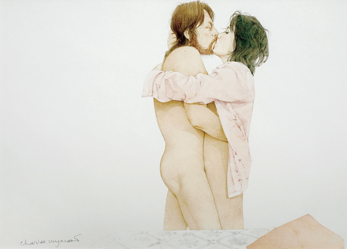
Charles Raymond, The Joy of Sex, detail #1, 1972. Colored pencil and gouache on paper, 15 parts total, 16 x 20 in. each, framed. Photo: Robert Wedemeyer.
But let’s not take it so fast. The Joy of Sex did more than make it okay to talk about sex; it also became a model for how sex should be (tender, which is nice, but also heterosexual and relatively fetish free, which is exclusionary and perhaps a bit rote), and thus is symptomatic of sexual standardization. As such, the illustrations reinforced a linear and proper notion of sex that became orthodoxy for an entire generation. The positions, the touching, the woman wearing the man’s shirt—it just looks so much like how sex “should” be. So while Raymond’s drawings win me over with their sensitive depictions of lovemaking, they do so through what has become a cliché. This duality, of becoming emotionally involved in the work while at the same time realizing how convention creates this affect, stays with me throughout the exhibition. It also leaves me wondering if it is my emotions themselves that are unoriginal.
So how is convention put to use so effectively in these and other works in Country Music? I believe the lack of formally innovative work, a weirdly smart and confident curatorial move, vitally serves to disarm the viewer and enable emotional connection. Like the personal tone of the press release and the honest depictions of lovemaking in Raymond’s illustrations, the absence of challenging form is just one more thing that softens us, enabling us to let down our guard. We recognize it, know it, accept it; it doesn’t challenge us; instead it says, “Come with me, I’m on your team.”
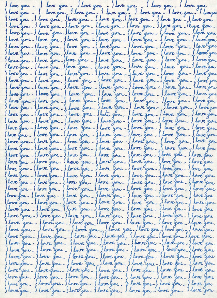
Emilie Halpern, First Love Letter, 2008. Silver gelatin print, 20 x 16 in. framed. Courtesy of the artist and Blum & Poe, Los Angeles.
Emilie Halpern’s work, which takes a prominent place in the largest of the gallery’s rooms, speaks to me in that way. Her Lost Time (2010), a small tangled length of magnetic audiotape (26.3 seconds worth or “the amount of time unaccounted for by our Gregorian calendar every year,” according to the checklist), occupies a centrally placed pedestal. On an adjacent wall, three more works are hung in a closely spaced group. To the left, a small framed photograph, entitled First Love Letter (2008), depicts “I love you” neatly handwritten dozens of time on graph paper (with one “I hate you” buried in there). At center is a 60 13/16-inch painted black square titled Moon Drift (1972-2010) (2010) (“the distance the moon has drifted from the Earth since the last Apollo mission”). And at right is another small framed photograph, titled Last Love Letter (2008), in which a crumpled, inscribed piece of paper is the central and only element.
In Halpern’s past work, such as Sun Kiss (2001), in which the artist’s silhouetted lips meet the celestial body, she often put forth an ineffable immaterial desire, presented in a straightforward manner through such devices as the title. She then would seek, through the physical properties of the material she chooses to use, to give us something else as a corollary of the stated desire. This something else, while never literally what was promised, is often a surprising remapping of emotional desire into a novel physical form. The artist thus pulls off a “bait and switch” without too many hard feelings, while further greasing the slippery chain of signification. With Sun Kiss, for example, she takes advantage of photography’s ability to conjoin onto the same two-dimensional plane objects that are spatially distant, thus accomplishing on paper what is impossible in reality. In Country Music, however, the sense of absence is much more profound; that which is not there feels huge and unknowable. While Lost Time pithily piles magnetic tape to represent the 26.3 seconds we lose each year in our rigorous devotion to an abstract delineation of time called a calendar (over decades and centuries that must add up, so where did all that time go?), Moon Drift gives us an opaque rectilinear void, a nothingness, to represent the distancing of two celestial bodies, the totality of each too vast for human comprehension. Of course, a length of audiotape is not a measure of time, and a black square is not a measure of distance. But both do more than simply depict the failure of material to represent mind-numbing concepts, although that is the guiding principal of both works. It is as if Halpern has given up trying to remap desire into unexpected corollaries, realizing such metaphors will always fall short. I fear she has consciously taken a much more cynical approach to the higher human emotions, and most specifically, to romantic love. Nowhere is this more evident than in First Love Letter and its companion piece, Last Love Letter. The first, in the guise of an infatuate’s sophomoric passed note, nonetheless represents sincere effort to put amorphous feeling into words, and creates a rigid pattern of text that becomes a recognizable, and thus understandable, abstraction. The second work, a crumpled up letter, represents submission, a recognition that the attempt to constrain love with words is in vain, or perhaps even an acceptance that it is the pursuit of love itself that is futile. Last Love Letter, like First Love Letter, is also a kind of abstraction, but one born of frustration and anger, which desists the quest.
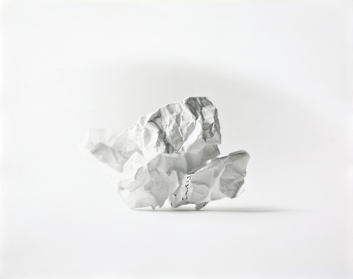
Emilie Halpern, Last Love Letter, 2008. Silver gelatin print, 16 x 20 in. framed. Courtesy of the artist and Blum & Poe, Los Angeles.
Interestingly, Halpern borrows forms from Conceptualism and Minimalism (repeated text, grids, rectangles) to address emotional matters. For example, her repetitive letter clearly references Baldessari’s interdiction in I Will Not Make Any More Boring Art (1971). Yet her actions contradict those of Conceptual art’s early practitioners, who left behind painting’s subjectivism in favor of text, photography, and industrial materials, in part to escape the emotional baggage of expressionism. And in the years that followed, mark making became so plagued by its association with expression that it did indeed pass over into cliché, thus allowing the language of Conceptual art to become dominant. It seems counterintuitive then that many artists today, including Halpern (and myself) are using Post-Conceptual strategies of re-photography and appropriation to address matters of the heart, as well as of the mind. In my case, I began to do so because they presented something of a clean slate as far as emotions are concerned, especially when compared to more expressionist modes of working. Of course, this is nothing new either, as Bas Jan Ader was already exploring the relation between emotion and Conceptualism in the early seventies, while some of his peers—including Dan Flavin and Robert Barry—understood the faculty of industrial materials and concrete language to transmit feeling. Looking at Halpern’s failed communiqué in Last Love Letter, I start to wonder if “emotive Conceptualism” itself could be nearing its expiration date, if simply because the strategy has become so widely practiced that it, too, is a cliché.
This would only be the case, however, if I judge the validity of a form simply in terms of novelty, which is one-sided and Modernist to boot, and thus rather worn-out itself. So it begins to dawn on me that in order to encourage emotional engagement (at least the more gentle kind—empathy for example, as opposed to outrage), challenging formal innovation might actually have to be suppressed. Thus, employing a familiar strategy, such as “emotive Conceptualism,” at least in Halpern’s case, might actually be a good one. The fact is that I am able to “read” Halpern’s content (which rings true due to my recent heartbreak) because I understand its use of a well-known language. Admittedly, this contradicts my previous assumption that I always seek innovative art that asks novel questions about form through an immersive and totalizing aesthetic, and in doing so, brings me to new and unrecognizable places. That is, I want to leave a show overwhelmed and scratching my head, wondering what it was that I just saw. And sometimes I do, and then again, I come to realize, sometimes I don’t. Often I want to leave a show feeling less alone than when I arrived, and scratching my head provides no comfort, at least in that regard. In light of my revelation, it now seems possible to me that some artists (and curators) may esteem known formulas because they value subtle interpersonal communication (empathy, compassion, identification) over innovation.
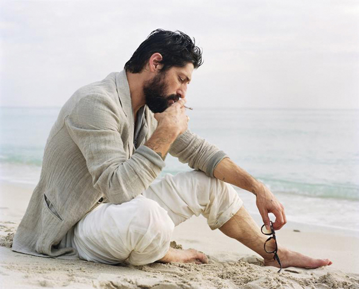
Jack Pierson, Self Portrait #31 (tony ward), 2005. Digital pigment print, 43 x 53 1/2 inches framed. Edition of 7. Courtesy of the artist, Blum & Poe, Los Angeles and Cheim & Read, New York.
The unlikely strategy of intentionally embracing cliché—not in order to investigate its derivation, but to exploit its possibilities—is utilized in a number of cases throughout Country Music. For example, Jack Pierson presents two of his well-known “found” signage text works and two “self-portraits,” which are large-scale, color portraits of desirable young men. In Self-Portrait #31 (Tony Ward) (2005), Pierson situates the scruffily handsome model/actor in relaxed linen garb on a sandy beach, with the horizon a soft blur in the distance. His subject, in what appears to be a reflective mood, has a cigarette in one hand and his eyeglasses gently dangling from the other, which strikes me as one offhand gesture too many. While I find the image tranquil and alluring—and pretty sexy—at the same time, it seems too good to be true. The image is so familiar, so recognizable. It just looks so much like tranquility should look. I recognize that this man is dreamily “lost in thought” because of a lifetime of seeing movies, television, and print advertisements. Interestingly, though, by titling photographs of other men “self-portraits,” Pierson turns their hackneyed form around. His action suggests the degree to which conceptions of self—and even our emotions—are determined by clichés. More radically, they propose that it is only through cliché—through recognizable form—that we have the kind of emotional experiences that make us feel loved, accepted, and less alone.
Elsewhere, and in a way everywhere, is Ry Rocklen’s Lucky Penny Pick-Up (2005), which is dissimilar to Pierson’s works in form, but not in strategy. Made up of dozens of pennies scattered heads up throughout the exhibition, Lucky Penny is actually rather hard to see because of the uneven tone of the gallery’s retooled concrete floor, and at first I miss it. It takes me some minutes before I notice a penny … and then another … and then another … and then I get it. There is a moment of surprise in this work, when one first becomes aware of it, and I also find Rocklen’s suggestion—signs of hope are all around us, if you just take the time to notice the small things—satisfying. His work brings a smile to my face, which is an exceedingly rare effect that really shouldn’t be discounted. Nevertheless, the “I got it” moment points to the work’s orthodoxy, its Martin-Creed-like witty retooling of Post-Minimalism. This work, like much else about the show—from the installation of the works to its customary “summer group show” format—is fairly conventional in form. From Halpern’s emotive Conceptualism and Pierson’s romantic portraiture to Rocklen’s post-Minimal scatter, the artists here are all working within recognizable practices, and perhaps that is by design.
It is clear to me that my response is not due to the works’ innovative forms, and that instead I relate to it in a different register, on emotional terms. My emotional fragility might be to thank, for I had recognized—post-break- up—that I was completely in love, and now my lover was gone. Raw and vulnerable, I was able to identify with the work in a way I might not have otherwise. My experience was not unlike a parallel but less painful phenomenon that occurs when I travel—my tendency to cry at less than tear-worthy movies on airplanes; I believe this happens because of my heightened emotional state during travel. On a trip I am usually going to, or coming from, somebody or someplace of importance. Anticipation and finality, significant forces in their own right, get bound up. Something has ended, something will soon begin. Held miles up by an invisible force, I am identifying with another’s pain, even Hollywood’s clichéd version of it, in a way I might not otherwise be if my feet were on the ground. Yet I remain plagued by contradiction. While I relate to the work on emotional terms, at the same time I resent the banality of my own emotions. Why else do I shamefully peek at the rows near me to check if another traveler has witnessed my tears? Is it me who is banal, or are all emotions hackneyed and overdetermined? Perhaps I’m confusing banality with commonality, and while the ongoing quest to regain the lost love-object might be unoriginal, it is also universal.
There are some instances in Country Music where the utilization of clichéd form comes off as ingratiating in a way that is hard for me to stomach, such as in Maureen Gallace’s merely facile weekend-in-Cape-Cod landscapes. I’ve never gotten why these should be considered contemporary art, and their inclusion seems to reflect the tendency of gallerists to cash in on cultural capital they have accumulated from mounting prior shows of more challenging work. Admittedly, here my cynicism gets the best of me. But for much else of the work in the show, unconventional practice seems to be intentionally shied away from in favor of known idioms executed with high degree of facility. Perhaps because I am so familiar with these modes of working, their form, in a sense, begins to melt away, and as I continue through Country Music I begin to notice it less and less. With innovation sidestepped, form becomes somewhat transparent, better serving to make an emotional, rather than intellectual, connection. Much like a love song or a romantic movie, it becomes a language that I immediately understand, meant for transmission, not reflexivity.
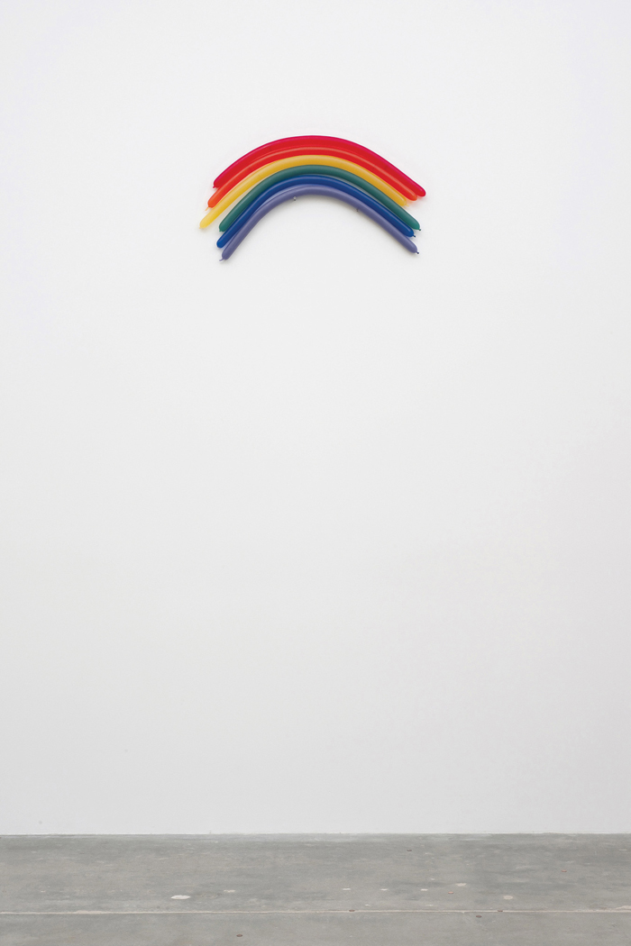
Richard Hughes, Thirty Pea Rainbow, 2008. Fiberglass, clear casting resin, 23 5/8 x 47 1/4 x 5 7/8 in. Courtesy of the artist and Blum & Poe, Los Angeles. Photo: Robert Wedemeyer.
Take Richard Hughes’s Thirty Pea Rainbow (2008), a wall-mounted sculpture of stacked tubular balloons, floating just slightly above a nail and screw and arranged one atop one another according to the logic of the color spectrum, thus forming a weightless rainbow. A closer look reveals that these are actually neither balloons nor nail and screw, and the checklist offers confirmation; they are made of fiberglass and resin, thus locating the work firmly within the convention of the “handmade readymade.” Gober-esque and firmly placed within tradition, I take pleasure in this adult variant of the childhood glee brought on from seeing a balloon incomprehensibly becoming an animal. The playful work owns its nostalgia and sentiment and, considering the pain I’m in, feels good.
There are some who feel there is no reason to invoke another rainbow or write another song about a broken heart, but not me. Hearts continue to be broken and such songs need to be written. I am sad and lonely, and as silly as it seems, knowing that I am not the only one makes me feel just a bit better. But the need to characterize my sentiment as silliness points to the problem: working within a clichéd form does more than just disarm the viewer, it often invites dismissal. The artists of Country Music risk being tagged as conventional (as well as sentimental) in an effort to transmit feeling to the viewer. They recognize the best way to do so is to present emotions in a language that we understand.
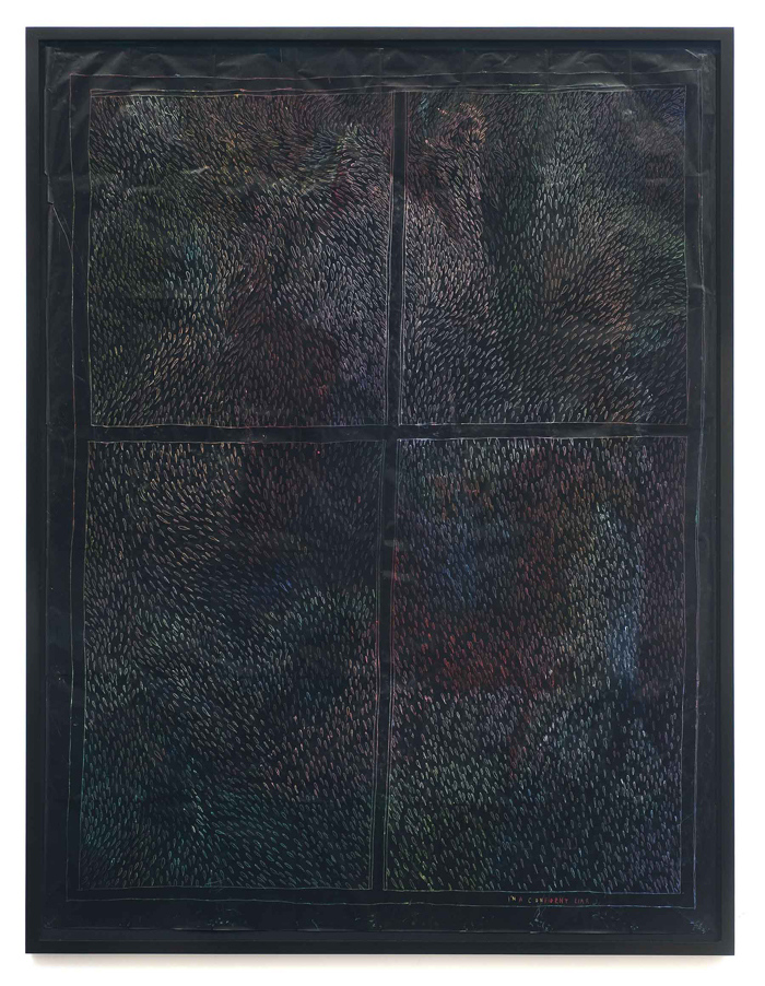
Friedrich Kunath, I’m a confident liar, 2010. Oil pastel on carbon paper, 87 3/4 x 67 in. framed. Courtesy of the artist and Blum & Poe, Los Angeles. Photo: Robert Wedemeyer.
Nowhere is this more apparent than in the work of Friedrich Kunath, whose work is hung in each of Blum & Poe’s three galleries and whose iPod playlist inspired the show. Over the years, Kunath’s intelligent and assured work has really grown on me. In Oh, Oh Lonesome Me (2010), a large drawing in oil pastel on carbon paper, he takes a chance with his rendition of a fanciful sailing ship riding baroque waves, its sails imprinted with the title of the work. Employing a child-like, whimsical line—recognizable from so many historical reiterations of various modes of primitivism—Kunath bravely shares with us that he feels alone. In doing so, he lays himself bare to charges of unoriginality through his utilization of well-worn form. At the same time, he leaves himself open to ridicule or dismissal for his frank, adolescent sentiment. It’s risky, knowingly using a hackneyed form to tell us something revealing. Especially because feeling alone isn’t all that original a sentiment––but nevertheless, it is a true feeling that we all know (again, the universality of emotions). I find his entire operation clever in the way in which he confidently uses a known form to share with us a common fear about which we don’t talk. Kunath remaps the location of risk from the formal, where the discourse of risk and artistic development often centers, to the place of interpersonal communication. His is in a no-man’s land where most artists, viewers, and critics fear to tread. The reason why so many contemporary artists are reluctant to enter this space could be as simple as a fear to share private matters. But perhaps it is more substantial, that many artists misrecognize the universality of emotions as clichéd, which is a tag that most artists are loathe to bear, even if it means a greater chance at interpersonal connection.
The struggle between my heart and mind stays with me throughout the show, the back and forth between the apparent sincerity of so much of this work, and that cynical inner voice warning me that I was being put on. Fittingly, it is Kunath who addresses this dialectic, most specifically in I’m a confident liar (2010), another large drawing in oil pastel on black carbon paper. The content is either a large, geometric abstraction of colorful, tear-shaped marks separated into quadrants, or a view out of a vividly rain-splattered, four-pane window. Firstly, the way these drawings are made, by rubbing on the reverse of the transfer paper to “pick up” color from the oil pastel hidden underneath, employs a technique that by its very nature is “blind.” This faith-based process acts as a material parallel to the questions of trust the work explores. In the lower right hand corner are the hand-printed words “I’m a confident liar.” Appearing in the space where a signature might have been found a few decades ago, the words suggest that the signature of the artist—the sign of authenticity—is in reality inauthentic. So do we take Kunath at his word and dismiss him as a liar? Or do we trust him enough, in light of his blind process and his willingness to insert doubt into the viewing experience, to realize that he, too, is trying to come to terms with the opposing tendencies of sincerity and cynicism? Do we believe that he is indeed truthful when calling himself liar? And does that thus make him not a liar at all?
Of course, sincerity can only be apparent sincerity, for one can never know if the other is being honest, and anything really worth believing in—be it God, love, or the words of another—can never be known for certain. As to my sense of being manipulated, is that not just a manifestation of my own fear? If I let down my guard I might start to feel connected, thereby running the risk of being hurt. Yes, the cynical person, always on guard, driven by the fear that he will be wounded, is less easily manipulated, but he also misses out. He (okay, me) goes through life with an ironic resolve, but with fewer emotional connections, dear friends, and true loves. These questions, like so much else in my life at the time, seem to come down to trust and control. Do I relinquish control and trust another? Is it possible to have an emotional connection to artworks and to others without letting down my guard and giving up control?
Trust. Trust is what I believe this show calls for, and is ultimately its subject. Trust requires of you to believe in another person or in something that cannot be objectively proven. When I let my guard down and truly let the work in the show do what it wants to do, when I trust it, the results can be powerful. I can experience the touch of Raymond’s lovers or recognize the sadness in Kunath’s anguish. That isn’t to say that I don’t know how or why this identification works, it’s just to say that I don’t stand in the way from letting it happen in the moment. In simple terms, I choose to go with it.
Karl Haendel is an artist who makes drawings, installations, and public projects. This spring he will have solo exhibitions at Galleria Raucci/Santa Maria, Naples and Yvon Lambert, Paris.