
Later, when I was able to see how personally debasing it is to find self-esteem in brands, I took duct tape and covered up every logo in my life.
–Tom Sachs1
NASCAR. What could be more American? Speed, Danger, Beer, Machines, Television—but above all, Branding. A skin of symbols covers driver and car alike. Team names are simply iterations of company names—the Kellogg’s car, the FedEx car, the Hot Tamales car. And how could it be otherwise? In the “capitalist-realist” aesthetic of NASCAR—airbrushed motion blurs, champagne-sprayed freeze frames—such pervasive sponsorship is just part of the action. Sean Kennedy’s recent Mixed Messages, wall works that flatten brand logos into a gory “capitalist-abstract” mess, would seem to be the opposite. These bright, contemporary mash-ups press race car paint jobs, small consumer products, and acrylic color schemes against sheets of Plexiglass screwed to deep white frames, producing slick planes of shapes and colors. Disposable razors, sand paper, electrical socket covers, plastic bowls, and so on accent designs derived from model stock car decals; the composition of sponsors’ logos suggests the repetition and chaos of a car body steamrolled onto a sheet of stickers. Areas of paint applied around and over the products constitute haphazard “color studies” that clash with or amplify the look of the included objects. In one untitled piece, the beige, peach and green 11s of the FedEx car form skewed patterns against several multi-toned toothbrushes super-glued to the Plexi. The corporate emblems of Dow, DIRECTV, Scion, and Budweiser move past naturalization, toward abstraction, and ostensibly become elements of pure composition. Kennedy’s oozing wall works would have NASCAR paramedics strolling grimly over with the jaws of life—no hope of survivors here—only packages and logos could have withstood such an impact: the transition from round to graphic.
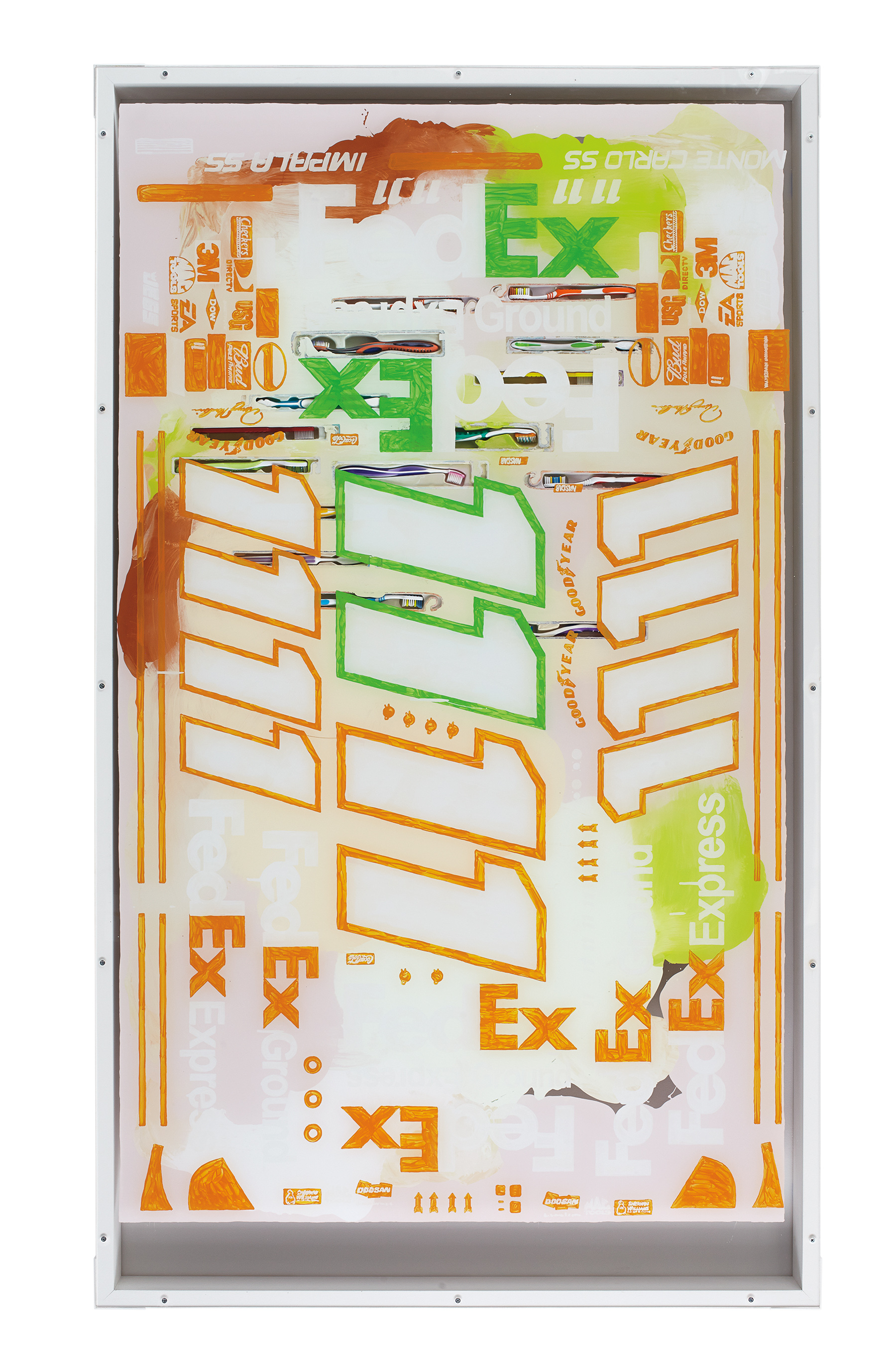
Sean Kennedy, Untitled, 2013. Acrylic on acrylic, wood, screws, polymer gel, enamel, toothbrushes, packaging; 72 × 42 × 3 inches. Courtesy of the artist and Thomas Duncan Gallery, Los Angeles.
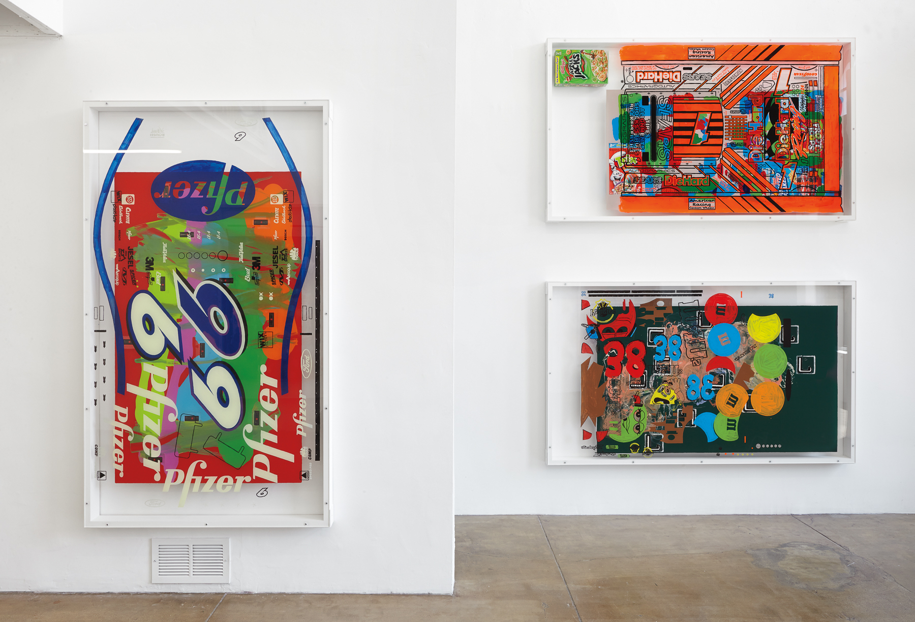
Indeed, the fifteen pieces on view at Thomas Duncan Gallery last fall, while cleanly bound by frames and transparent margins, portray a sloppy high-speed collision between disciplines: the legacy of Abstract Expressionist painting, however ironically invoked; the ergonomic styling of the things we buy; and the logos that are the ground crew of advertising. Preempting the joke that punctures the “all-over” canvas—Which way is up?—the artist points out that the pieces may be oriented in any direction (or rather, in any of four directions). There is no “up” here, only a wry, “nonhierarchical” absorption of brands—corporate and artistic. In the time-honored tradition of Pollock, Stella, Warhol, Basquiat, and company, the painting itself is the signature. Kennedy willingly flattens—spreads out, for the spectating—the strata of our thoroughly branded condition, incorporating ad hoc the logos splashed decoratively yet deliberately across race car bodies into his own personal aesthetic product.
But, following Pop, Abstract Expressionist, and Neo-Expressionist precedents, we might also recognize in Kennedy’s recent series the ghost of Ashley Bickerton’s Tormented Self-Portrait (Susie at Arles), 1987/88, whose machined and logo’d surface once painted quite a different picture of incorporated existence. Here a large metal and plastic box is decorated with the insignias of the artist’s chosen brands: Body Glove, Marlboro, Trojan, Deer Park, the Village Voice, and CalArts, among others. The piece’s steel and aluminum rivets and black sides, its fantastic oversized brackets, and the ominous roll of leather along its bottom edge convey an unmistakable cynicism toward the consumer society that would facilitate such an object. Bickerton’s reference to the Arles of Van Gogh—a famously tormented self-portraitist—nods toward the idea that individual style is proof of genius. More pointedly, Bickerton (as well as contemporaries Peter Halley and Jeff Koons) took the resurgent self-branding at the core of the Neo-Expressionist project to an absurd level, moving slick corporate transactions to the surface of the work.
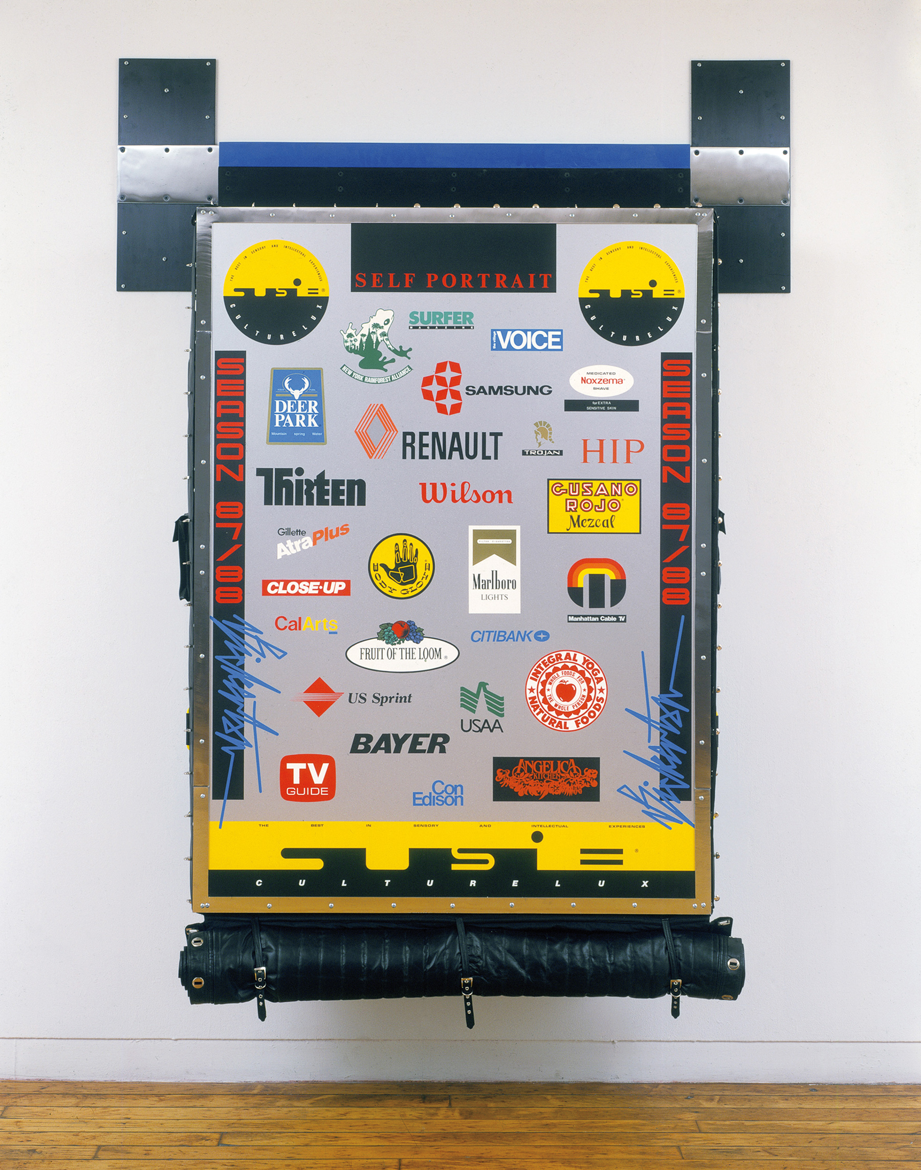
Ashley Bickerton, Tormented Self-Portrait (Susie at Arles), 1987–88. Synthetic polymer paint, bronze powder and lacquer on wood, anodized aluminum, rubber, plastic, formica, leather, chrome-plated steel, and canvas; 89 1⁄2 × 68 &/10 × 15 3⁄4 inches. Collection of The Museum of Modern Art, New York. Courtesy the artist and Lehmann Maupin, New York and Hong Kong.
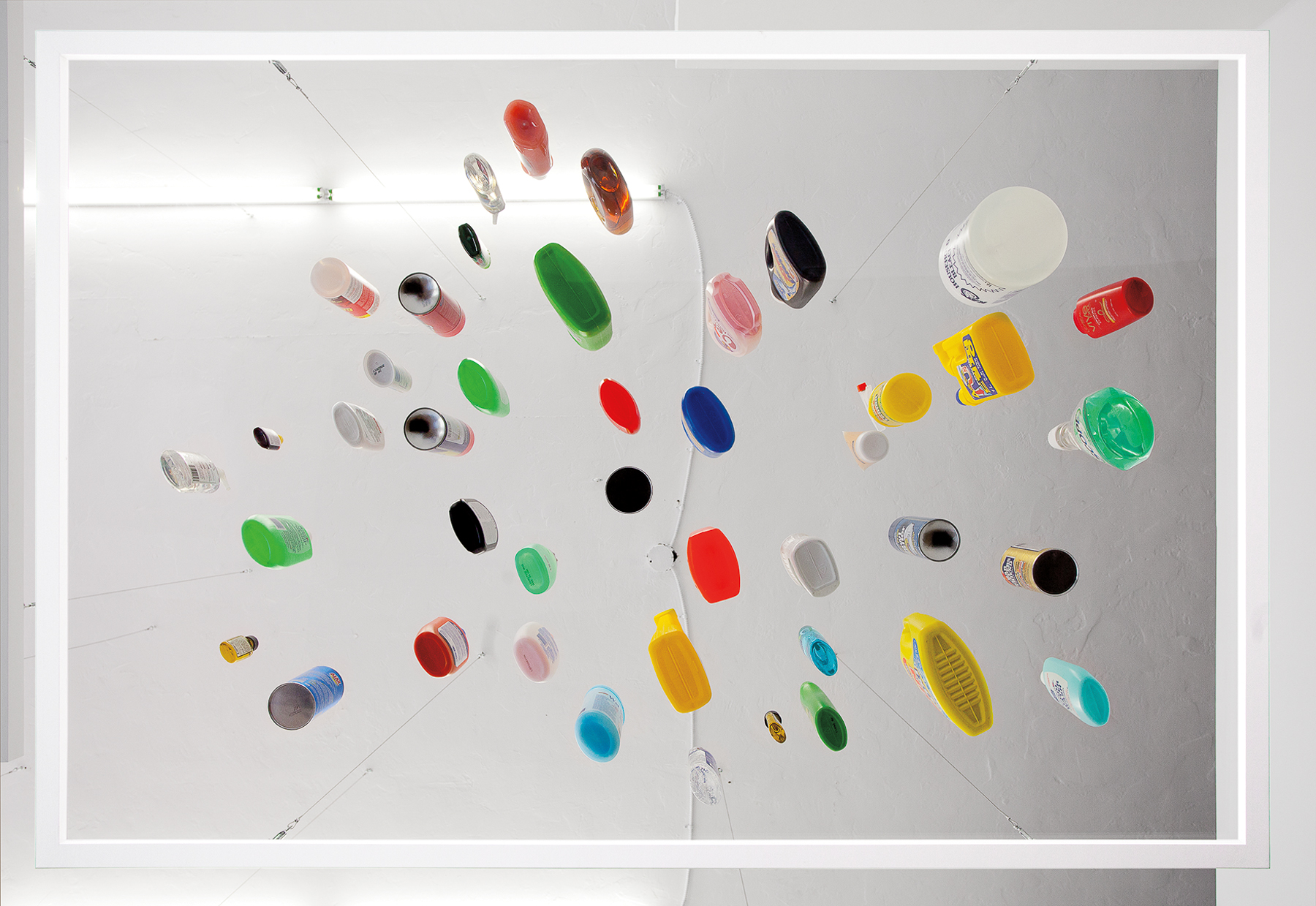
Glancing off 1940s AbEx, 1960s Pop, the 1980s backlash against corporate entanglement, and the mainstreaming of heavy lifestyle branding that followed—reactions and anti-reactions that laid the groundwork for the present acceptance of such a high degree of sponsorship—Kennedy’s glib Mixed Messages represents a far less conflicted, if nearly as cynical, navigation of consumer culture. As with Bickerton, Kennedy’s application of logos signals, at bottom, his awareness of self-branding. The Mixed Messages works resemble in size and spirit Kennedy’s ongoing, untitled series of hanging Plexiglass platforms that hold a variety of expressively scattered objects. Products—some more conspicuous than others—form the basis of abstract compositions that nonetheless cling to the familiar realism of consumer goods. One work, for example, employs cleaning supplies to produce a field of colored plastic ellipses. Their labels are visible, of course; and several products, such as Scope mouthwash, we might recognize simply from the proprietary shape and color of the bottle. In both bodies of work, Kennedy’s use of logos and commercial products as graphic elements constitutes a reductive appropriation of the “brand landscape” into decidedly formal artworks, absorbing the carefully calibrated aesthetics of big box stores and sponsored spectacles into the artist’s own brand of contemporary art.
Sean Kennedy, Untitled, 2012. Acrylic glass, wood, aircraft cable, turnbuckles, eye screws, and cleaning products; height variable, 493⁄4 × 733⁄4 inches. Courtesy of the artist and Thomas Duncan Gallery, Los Angeles.
It would seem that branding has survived the dry wrath of Bickerton and Halley—not to mention the dedicated antiglobalization movement, which found a manifesto in Naomi Klein’s book, No Logo, 1999. Indeed, the burden of “lifestyle branding” has been passed on even more fully to the individual, who is now “free” to “curate” her own style by remixing and mashing-up the flow of culture. Perhaps the most we can hope for is to choose our brands before they choose us—modulating the semiotic fluid that, almost at birth, replaces the amniotic. True to the times, Kennedy’s work embraces the shift away from polemical abstraction (where, for example, Halley’s bright rectangles in fact depicted the capitalist geometry of circuit boards and prisons) toward neutral stylization. Yet a reading of this work as emptying out brands, of neutralizing them, underestimates the strength of brand recognition. Pop art reached a stalemate with conservative America, finding common ground in its most wholesome symbols, while at the same time solidifying the iconic stature of Campbell’s and SPAM. Kennedy submerges crisp graphics in the slop of personal expression—yet the logo persists: a burnt orange Camel vibrates against passages of mauve; a Hot Tamales ridgeline crosses a creamy pink acrylic desert. Kennedy’s work conforms to the designs of corporate sponsorship at the level of the logo—those infinitely stretchable graphics having already withstood the translation from car wraps to blimps and windbreakers. This, says Kennedy, is the water we swim in. His actual layering of logos and signs mimics the daily diet of ads delivered by billboards and supermarkets and web pages. Still, no advertising is bad advertising. Kennedy uses logos only insofar as logos use him.
Sean Kennedy, Mixed Messages, 2013. Ground floor installation view, Thomas Duncan Gallery. Courtesy of the artist and Thomas Duncan Gallery, Los Angeles.
But the resiliency of logos can only help these works trade in the currency of abstract painting. Mixed Messages appropriates brands without malice, presenting a dull-edged détournement—and delivering, in the process, art you can feel good about buying. What distinguishes Kennedy from earlier brand-aware artists? Certainly Bickerton’s and Halley’s cynical consumerist statements sold well enough (to say nothing of Koons), and surely didn’t hurt CalArts’ or Trojan’s business. Yet in a context of unfettered and high-dollar expressionism—Modernist corpses resurrected in Postmodern clothes—Bickerton’s bitter, self-reflexive “portrait” nonetheless defined itself against the brand saturation of modern life. The Susie works are heavy with gallows humor, while there is little in Kennedy’s Mixed Messages to suggest any resistance, no matter how futile or internal, to such a condition. Kennedy is aware of, but neither fluent in nor critical of, the range of styles available to the contemporary artist. Rather, if artists of earlier, pre-Postmodern eras could claim a certain naïve purity as regarded the market, Kennedy’s work exhibits the market-savvy ambivalence that has become de rigueur. The series is gloriously abstract—bold, eye-catching, beautiful and new in the sense of all the best products—yet flashes just enough “message” to pacify those squeamish about abstraction’s violent escapism.
Travis Diehl is the founder and publisher of Prism of Reality. He is the recipient of a 2013 Andy Warhol Foundation / Creative Capital Arts Writers Grant. He lives and writes in Los Angeles.