
Farewell, Reversed R
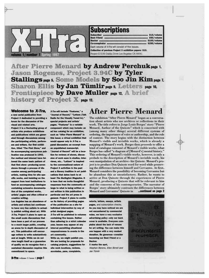
Welcome to X-TRA, a quarterly journal published in Los Angeles and dedicated to the thought-provoking consideration of contemporary visual art. With this redesign, X-TRA comes far from its off-the-cuff and zine-y roots of fifteen years ago. You will find this incarnation more book-like— something to spend time with, pack on a trip, or have handy to read at night. We trust you will wish to keep our journal in your library, if only to enjoy the special effect of our new spine.
The new look and feel of this issue are the results of a year’s worth of discussion between the Editorial Board and the Publishers about what matters most about what we do. We continue to publish excellent, critical writing about some of the most challenging contemporary visual art being made. We remain committed to a physical reading experience, believing that the intimate address of the printed page is the least fragmented and most satisfying thinking space we can provide. In addition, we maintain our perspective from Los Angeles and continue to provide a place of record for the Los Angeles art world.
Some things have changed. We are a smaller, denser package with a more flexible design that incorporates some, but not all, full-color printing. Readers may also notice that we have done away with the feature/ review/column hierarchy, and our contents are now interwoven to create a better reading experience. Another change reflects the fact that our readership has grown increasingly global (as has the art we cover), and much of that readership will never see a physical copy of X-TRA. As a result, we are simultaneously launching a new website that will make available the full contents of each issue and eventually our extensive archive of past issues.
We have always been committed to conspicuously authored design for X-TRA (most evident in our early years, when we gave over the design of the publication to a different designer with each volume). We wish to thank Aaron King for seven extraordinarily productive years of collaboration and growth. Aaron gave us a consistent and professional look, which allowed us to grow into to our mission. Volume 15 launches a new collaboration with Brian Roettinger of Hand Held Heart. Brian’s new design leaves behind the reversed R of our logo. Perhaps that is an appropriate move for a publication trying to keep all eyes focused ahead as we navigate the uncertain waters of art writing and publishing for the next fifteen years.
We thank you for reading. If you haven’t already, please subscribe, or throw all caution to the wind and make a big donation. We did.
The Editors