
Introduction by Leslie Dick
In July 2009, Adam Feldmeth went to the Venice Biennale. Immediately struck by apparent inconsistencies in a reconstruction of a Blinky Palermo installation from 1976, he set about his investigation. Using his iPhone like the classic detective’s magnifying glass, Feldmeth made careful observations, contacted various parties involved, and traced the clues, all the while collecting photographs of the scene, as well as generating scans, schematic drawings, diagrams, and conducting experiments. In January 2011, Feldmeth presented the evidence in a lecture with projections at the California Institute of the Arts. The following text is an edited excerpt from this presentation. In the process of discovering the underlying premises of this curatorial project, Feldmeth’s analysis opens up a set of questions regarding site-specificity, memory, and the deeper problems of repeating history.
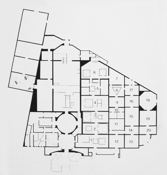
Diagram of the “Ambiente Arte” exhibition in the Padiglione Centrale, Venice, 1976, from Michael Asher, Writings 1973–1983 on Works 1969–1979(Nova Scotia: the Press of the Nova Scotia College of Art and Design with the Museum of Contemporary Art, Los Angeles, 1983). Courtesy of Michael Asher.
I had hoped to talk here while the Blinky Palermo retrospective was still up at LACMA, but that became impossible.1 Nevertheless, I have the opportunity to be here tonight while the de-installation of that exhibition is taking place.
“Himmelsrichtungen, 1976; Reconstruction, 2009; Steel, Glass, Paint.”2 In 1976, Palermo made an architectural environment in the “Ambiente Arte” exhibition, curated by Germano Celant, at the Venice Biennale. The title of Palermo’s work has been variously translated as “Ordinal Points,” “Cardinal Points,” “The Four Cardinal Points,” and “Directions of the Sky.” These interpretations emphasize what a functioning compass, magnetically charged to the earth, signifies.
In Christine Mehring’s Blinky Palermo: Abstraction of an Era, she writes:
In Italy, Palermo installed four large glass panels framed in black steel and covered from behind with thick layers of paint, in respectively yellow, red, white, and black, diagonally across the corners of a room with a central skylight. As can readily be reconstructed based on mapping surviving color photographs onto the ground plan of the building, the yellow panel was located in the north, the black in the east, the white in the south, and the red in the west.3
For the steel, Mehring provides us with the adjective “black.” She translates the title as “Ordinal Directions”; she provides the dates of the Biennale, July 18 through October 16, 1976,4 and she indicates the use of oil-based paint. In the most rudimentary way, steel, glass, and paint describe the material installation. It is, however, crucial how additional modifiers are applied to these three industrially produced materials.

Diagram of the “Fare Mondi / Making Worlds” exhibition in the Palazzo Delle Esposizioni, Venice, 2009, from official Venice Biennale program brochure.
Made up primarily of artists associated at the time with tendencies now ascribed to Arte Povera and California Light and Space work, the contemporary section of the 1976 Biennale provided each artist with an individual room in the exhibition.5 According to the floor plan, Palermo had room 8.6 Robert Irwin was in the adjoining room 17,7 and Daniel Buren in room 9.8 Their contributions flanked room 8.9 Each exposed a direct passage to the exterior and its climate.10
The floor plan for the 2009 exhibition shows that the reconstruction of Palermo’s work has moved into Irwin’s space from 1976.11 This was in part because the partition wall, delineating the expanse of room 8, had been removed during the interim.12
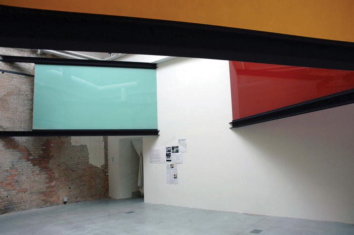
Documentation of 2009 reconstruction attempt of Himmelsrichtungen (1976) in “Fare Mondi / Making Worlds” at the venice biennale, November 2009. Photo: Adam Feldmeth. Upward view from south corner, underneath white pane.
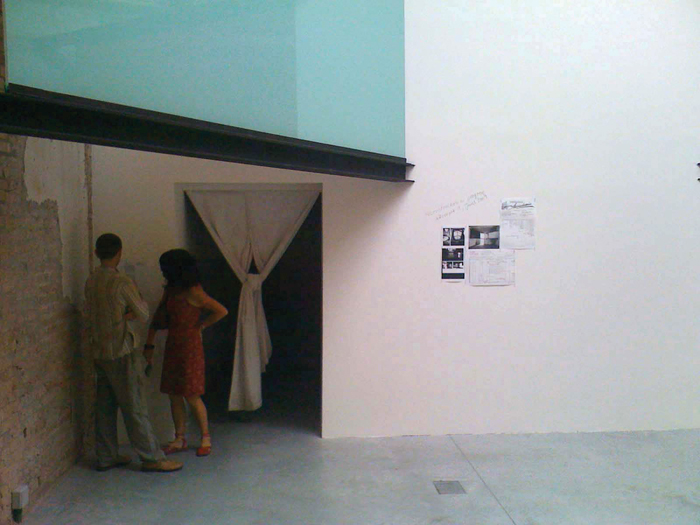
On July 21, 2009, I entered the building in the Giardini, eventually walking from a room of Rachel Harrison’s works into the Palermo reconstruction. I recognized the work under suggestion yet sensed variables I couldn’t quite reach. The formal didactic in the room noted:
The formal didactic in the room noted:
To reconstruct a work of art always involves difference and repetition. Palermo’s Himmelsrichtungen was conceived as a site-specific installation for this pavilion in 1976, and was destroyed after being dismantled. This is a reconstruction, which follows the rich information of the Archivio Storico delle Arti Contemporanee of the Fondazione La Biennale di Venezia. To revisit a previous moment of the Biennial in this way will always provoke critical discussions. This discussion is an integral part of the project.13
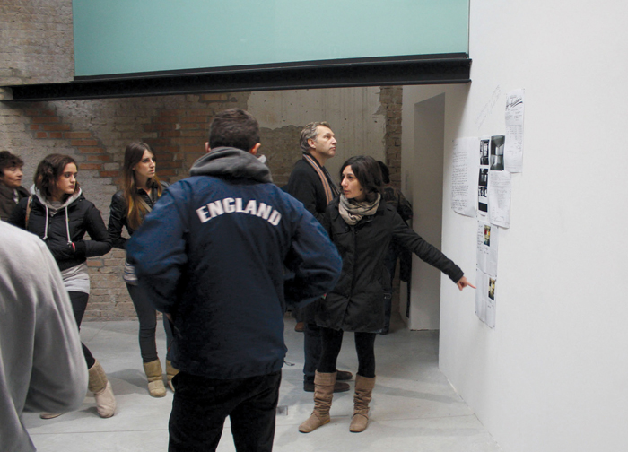
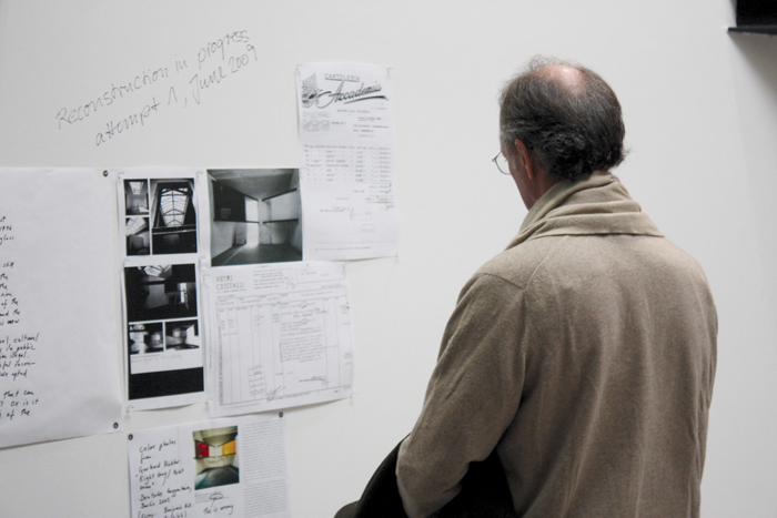
To the right of this didactic and on the other side of a doorway were five documents tacked to the wall, presumably the rich information of the Biennale Archive: black-and-white photocopies of the 1976 catalog pages documenting Buren and Palermo’s contributions; a color scan of a black-and-white photograph, printed in grayscale; and two invoices from 1976, from the paint and glass suppliers.14
Black, red, yellow, and white acrylic; 252 tubes and 28 jars of “flow formula,” and 27 large tubes of “standard [formula].”15 The invoice for the glass company provides information on length and width: four 200 x 300 centimeter sheets, three pieces that measured 100 x 211, and one at 84.5 x 143.5 centimeters.16 Above this documentation on the wall, handwritten in black marker, were the words: “Reconstruction in progress; attempt 1, June 2009.”17
I read the didactic and looked at the documentation display. I spent some time in the room making a few mental notes and ended up searching for an email address and writing that night to Daniel Birnbaum, who was directing the Biennale, with a couple of questions.
Documentation of black and white photocopy of p. 219 from the “Ambiente Arte” catalog with views of Himmelsrichtungen, November 2009. Photo: Adam Feldmeth. Photocopy tacked to wall June 2009. Handwritten note added September 2009.
In autumn 2009, various periodicals reviewed the Biennale. Images of the reconstruction were included in Artforum and Art in America. From what I’ve read, every acknowledgement of the reconstruction in reviews contains a positive remark on its inclusion and/or the curatorial effort. This seems odd because in regards to the “difference and repetition” that was indicated, I was seeing a great deal more of the former than the latter. I wasn’t able to recognize, after a while, anything except inconsistencies, variables that were on a different frequency from the available descriptions I remembered of Himmelsrichtungen.
Regarding color, Palermo was German and a student of Joseph Beuys, which has led to one thought that the colors correspond to national identity, as represented in the German flag.18 This nationalist interpretation either neglects the title entirely or treats it as loosely metaphorical. A differing hypothesis recognizes that these colors are found in Native American cardinal symbology.19 The colors of the German flag(s) relate to Palermo as a student of Beuys, while a symbology from the American West corresponds to a location beyond national borders.20
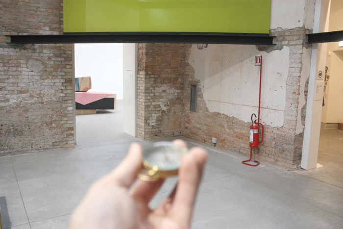
Compass experiment facing due North, November 2009. Photo: Adam Feldmeth.
The building in the Giardini (in 1976 called the Padiglione Centrale, the Italian Pavilion, and in 2009 the Palazzo delle Esposizioni) is not built on a N, S, E, W axis. It is at a clockwise tilt, approximately NE, SW, SE, NW. Kuper suggests the reason for each corner having a designated color is to produce a N, S, E, W alignment: to charge the room as an environment-cum-compass.21 Perhaps this makes sense in a big exhibition building, where one can feel lost amongst multiple rooms, or in Venice, a city without grid logic. Further, it may point to an environment or alignment beyond borders, be it phenomenological or artistic.
The reconstruction, with the white looking more spearmint green, the yellow looking more dingy lime, frays either hypothesis from maintaining any traction. There was a divide between where I was standing and the implication of the installed elements. I couldn’t locate myself.
Palermo was notably reticent in commenting on his own work. One remark is applicable to the portion of his practice that has since been labeled as the “wall paintings,” experiments with wall planes within adjoining architectural composites. “[The work] does not stay in the photograph; it stays only in the memory of someone who actually stood inside [the space].”22
Palermo’s statement draws a distinction. You can’t enter into this work through treating such documentation as a window. I found myself wondering to what extent the photocopies on that wall were guiding the reconstruction, curatorially and publicly. This would be inadvertently moving against the very grain that Palermo asserted as fundamental to encountering such work.
In 1976, room 8 was raw; brick foundation walls held peeling white paint. Palermo supposedly took this as a point of engagement, in that the inclusions of the glass and the paint would provide a smooth counter-weight to a weathered and decrepit interior. Structural steel, a distinction from the wooden beams overhead, bracketed this bridge.
iPhone documentation of visitors reading didactic under white pane of reconstruction attempt, with primary document display at right, November 2009. Photo: Adam Feldmeth.
In 2009, a redesign of the southeast end of the Palazzo into a cafeteria took place during the early stages of exhibition planning. This construction included tearing out the plaster from a wall in an adjacent room, formerly 17, substantially exposing the underlying brick. When curators came for an early site visit, as was told to me, the potential for reconstruction appeared if the removal of plaster from an additional two walls along the perimeter of the room was carried out. The benefit of this removal is the exposure of an environmental history laid bare: a build up of a patch-worked foundation.
The installed beams in 2009 were steel. The distance from the floor to the beams’ lowest point was 210 centimeters. This is where the attempt, intention, and dream of doing a reconstruction met the logistics and pragmatics of present day Venice. Safety codes had been updated in the last thirty-three years. The curators decided this height would be approximately accurate for the reconstruction, as they found no exact record of the installation height from 1976.
The most prevalent way a sheet of glass is produced is through a floating process.23 This glass yields a 0.1 percentage of iron(II) oxide, a stated impurity of the process that causes a green tint. This tinting is present unless further chemicals are added to purify the product into crystal glass.24 This green is noticeable from the side view of nearly any sheet of glass, while the view through the sheet is often transparent.25
Safety codes again determined the decision regarding the glass used for the reconstruction. Laminated safety glass similar to that found in car windshields was required, which has an interlayer of polyvinyl butyral (PVB), a resin bonded between two or more layers of glass.26
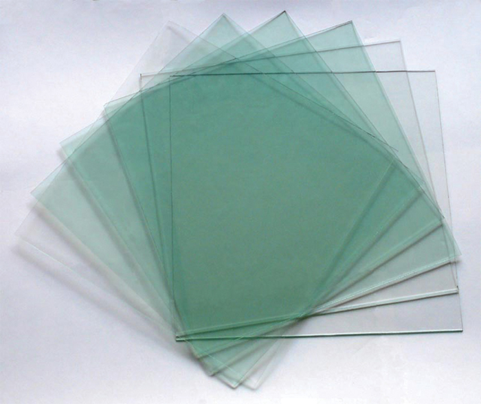
Illustration of iron oxide amplification through layered gradation of loose, three-millimeter-thick sheets of float glass. http://www.jti.net.cn/uploadfile/webeditor/20092314154959.jpg. Courtesy of Joint Talent Industries Limited.
When pieces are stacked, the visibility of green is equally multiplied. The 1976 invoice indicated the glass was 6 millimeters in depth. In 2009, my measurements of the glass with PVB interlayer record 25 millimeters.27 Due to these differences, colors change.
A difference in dimension was not limited solely to depth. The off-the-press sheets were 200 x 360 centimeters, a significant departure from the “200 x 300 cm” that appeared on the invoice tacked to the wall.28
The white, yellow, and red paints were gloss. The black was matte. All were house paint. The paint was generously applied to the corner-facing sides of each pane of glass.29
Germano Celant visited the reconstruction before the exhibition opened in June and confirmed, “This is exactly how it was.”30
On August 4, I found myself in Berlin. I took the opportunity to learn what more I could from this artwork.31 While on my way to a bookstore I ended up walking past the Neue Nationalgalerie.32 On this occasion the gallery was hosting an exhibition by Imi Knoebel, who was a close friend to Palermo.33 He had painted the interior of the glass perimeter walls white.34
Knoebel made white walls where there were none. This gesture, a direct engagement with the exposure that this building allows onto the artworks inside of it, evidently blocked the ability to look in, emphatically privatizing the exhibition within the space. At almost any other time one could walk around this pavilion and, from a distance and multiple vantage points be able to publicly observe the private exhibitions inside. Knoebel’s architectural commentary veiled the interior; only through purchasing a ticket was it possible to gain access to his exhibition. To enter the space visually was to enter it corporeally.
Intending to return at a later date, on August 16, I realized the exhibition had closed on the ninth. I raced down, hoping that de-installation would concentrate initially on works inside before the glass was cleaned. This was the case. I arrived an hour before dusk with all but one perimeter wall cleaned for the day. I returned the next morning, sat down on the plaza, and watched as the space was opened back up from the inside, the removal of the fourth wall, as it were.
Documentation of expanded document display of 2009 reconstruction attempt, requested by Adam Feldmeth, September 2009. Courtesy of the Venice Biennale Press Office.
On the same day, some of Palermo’s works on paper were included in a show at the Deutsche Guggenheim.35 The artworks themselves were not the draw; more important was a reading room I anticipated would adjoin the exhibition.
While looking down at an obscure catalog, my thoughts raced. “Wait a moment, I’m in the Deutsche Guggenheim. Wasn’t there a Gerhard Richter work called Acht Grau that happened here? And he was a friend to Palermo. And didn’t Acht Grau involve large pieces of glass? Are they correlated to Himmelsrichtungen?” I looked up: across from me in the little L-shaped reading room was the Acht Grau catalog!36 I opened it and lo and behold, in an essay by Benjamin Buchloh, there were two views of Himmelsrichtungen in color.37 They were being used as historical markers, precedents for this 2002 work by Richter. While I had seen this catalog previously, I had not remembered these supplemental images. This was the first time I had come across a color image of the white pane since seeing the reconstruction.38
In the meantime, I had written again to Birnbaum and asked if it would be possible for me to travel to him so that we might talk face to face. He responded agreeably and we arranged a date. On August 19, I took a morning train and arrived in Frankfurt by midday.39
Before I could question the deviation in color, Birnbaum stated that there were no existing color photographs of the 1976 installation. I interjected and confirmed otherwise, pulling out my iPhone, which I had used to photograph the images from the Acht Grau catalog.40 Birnbaum excitedly acknowledged this evidence as contrary to the reconstruction.41 With a clear awareness of his responsibility, we set out to confront the problem.
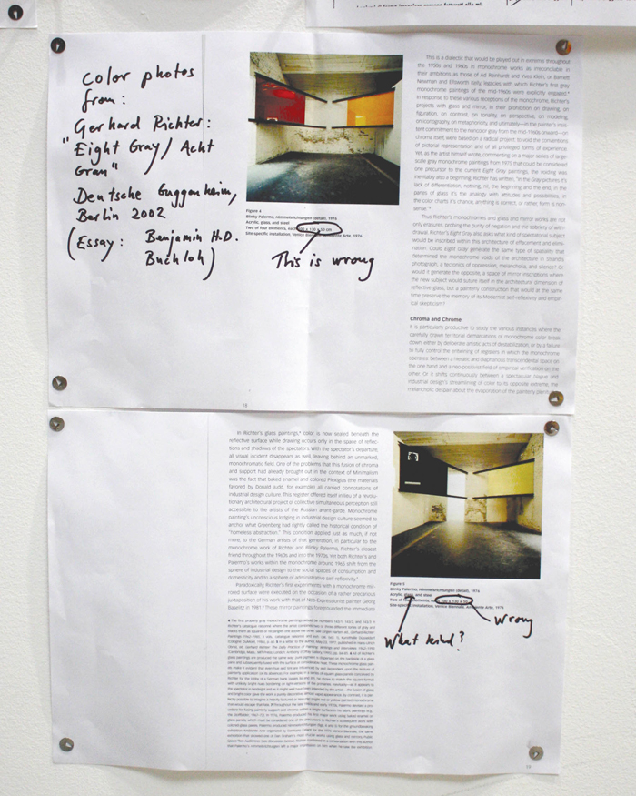
Documentation of color photocopies from Acht Grau catalog, with Daniel Birnbaum’s handwritten notation, added to document display in september 2009, November 2009. Photo: Adam Feldmeth.
The conversation shifted to a consultation as to whether a physical correction could occur, while still adhering to safety codes, in light of this new information. I posited that Plexiglas would be a non- distorting, cost-effective substitute yet warned that its primary drawback was that it too would constitute a deviation. I then posed an alternative: why not simply produce color photocopies and build onto the document display that had already been initiated?42
On September 4, two color photocopies were added to the documents tacked up in the room, as well as four handwritten questions, which Birnbaum and artistic organizer, Jochen Volz, had asked themselves shortly after the reconstruction was installed. The copied pages from the Richter catalog included handwritten bibliographic information in the margin, as well as an indication that the listed dimensions are incorrect.43
A footnote appears on one of the pages:
In 1976, Palermo produced his first major work using baked enamel on colored glass panes.44 Palermo produced Himmelsrichtungen (figs. 4 and 5) for the groundbreaking exhibition Ambiente Arte organized by Germano Celant for the 1976 Venice Biennale, the same exhibition that showed one of Dan Graham’s most crucial works using glass and mirrors, Public Space/Two Audiences.45 Richter confirmed in a conversation with this author [Buchloh] that Palermo’s Himmelsrichtungen left a major impression on him when he saw
the exhibition.
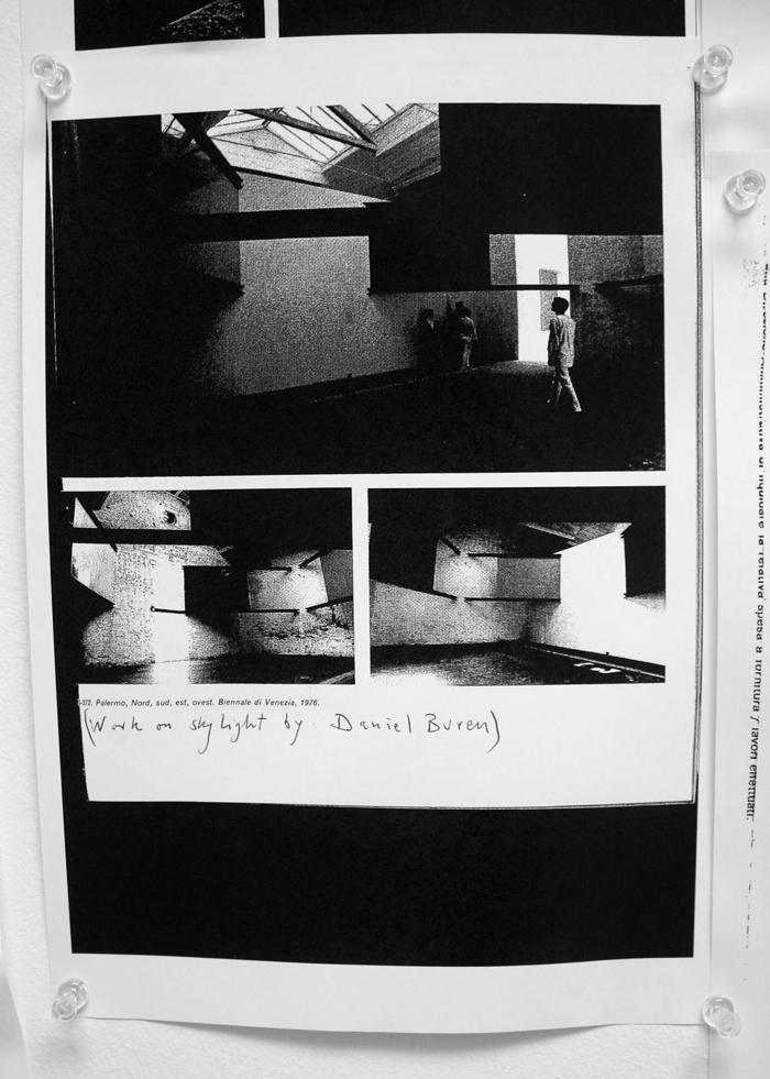
“Works on skylight by Daniel Buren,” another handwritten note, was added by Birnbaum to one of the black-and-white photocopies.46 This addition heightened attention to the titling from the 1976 catalog, appearing in fine print immediately above it. Here, the work was not titled Himmelsrichtungen, but Nord, sud, est, ovest.
Documentation of docent tour utilizing color photocopies of document display in discussion with school group, November 2009. Photo: Adam Feldmeth.
Documentation of visitors studying documents in reconstruction attempt, November 2009. Photo: Adam Feldmeth.
The curators’ four questions:
One, Materiality: The glass produces a green hue most visible in the white panel. Was this really the case in 1976? Or did they use Plexiglas? Or was there a kind of glass that did not produce this effect 33 years ago?
Two, Placement: North remains north, and south is still south. But the building is the “same” and so is the institutional context. But if the architecture of the building has changed so that the space in question doesn’t exist, what is the most correct placement of the work? A space that has the right dimensions and the right skylight, or a reconstructed space that requires new walls to be built? We opted for the former.
Three, Time specificity: Between 1976 and 2009 the visual, cultural, and “legal” context has changed. The safety regulations in public buildings have changed, making a “correct” reconstruction illegal. Would a version that is illegal today be a more truthful reconstruction of a piece that was totally legal in 1976? We opted for the legal.
Four: Is the work a conceptual work that can be reconstructed after the demise of the artist? Or is it a painting that requires the unique brushwork of the painter’s hand? We don’t know.
These questions, while still curatorial, introduce a distinct tone of voice, divergent from that found in the didactic statement.
Regarding question one: the color images operate in conjunction with and expand on the clarity of this question. Without acting as an answer, the images encourage deeper consideration of its utility.
Documentation of visitor studying documents in reconstruction attempt, November 2009. Photo: Adam Feldmeth.
Question two skirts the particular issues that make the reconstruction what it is, precisely by indicating that “right dimensions” and “right skylight” are truth-based assertions. Because there is a skylight overhead and the room approximates the dimensions of 1976 does not mean ambivalence goes away and that we come back to some form of semblance. The skylight in room 8 was/ is proportionally more expansive than the skylight in the reconstruction. Yes, a skylight is found in both, yet in terms of the amount of light coming in, as well as the color of the sky presenting itself on the other side of that expanse of glass, where are we discerning differences?
In addition, I don’t understand the statement that the institutional context of the building has remained the same. It’s still the Biennale; the structure still stands in a rudimentary capacity, but the history that’s occurred before and after 1976 has built up the walls themselves. Pulling down the plaster is a clear indication that it has continued to change, that it is in no way the same.
Note the presumption in the third question that the initial installation was accomplished legally.
In the final question, if a work is deemed conceptual, it can therefore be reconstructed. This would seem to suggest a notion of Conceptualism in which execution instructions are provided. Palermo’s declared understanding of the document’s functionality runs counter to that of blueprints.
As for the brushwork, it’s not entirely clear if Palermo actually painted with his own hand. Two quite different accounts come from the same man, Franz Dahlem, who was present during the 1976 installation.47 He told Birnbaum that he himself painted the black pane of glass. On another occasion, he told Kuper that Palermo was unenthusiastic during installation, sitting in a corner, while Dahlem executed the entire painting. In regards to the artist’s hand, it is unclear who the painter was. I am unsure how the question of “unique brushwork” applies there.48
Close-up view of paint marks on floor in reconstruction attempt, November 2009. Photo: Adam Feldmeth.
Close-up view of paint marks on floor in reconstruction attempt, November 2009. Photo: Adam Feldmeth.
Close-up view of paint marks on floor in reconstruction attempt, November 2009. Photo: Adam Feldmeth.
Close-up view of paint marks on floor in reconstruction attempt, November 2009. Photo: Adam Feldmeth.
From July onward I had become all the more curious as to who had painted the reconstruction. Initially, Birnbaum indicated to me that construction workers had installed the I-beams and the glass, and art students from the Academy in Venice, in an educational offsite initiative with the Biennale Foundation, applied the paint. Later, however, he updated me, reporting this wasn’t the case. The intention of involving students was vetoed by Dahlem, who advised that the construction workers should execute the painting portion as well.49
The display of these additional documents and notes effectively initiated a second phase of the reconstruction, albeit unannounced,50 a notion originally expressed by Birnbaum when referring to plausible material changes. Due to the presence of the Acht Grau catalog pages, portions of Buchloh’s essay as well as footnotes were now included in the room. This contradicted the didactic statement, which claimed that the “rich information” of the display was coming from the Biennale’s own archive. An outside source cultivated a spatial history that was beyond the room and the Biennale context. A series of names was invoked: Richter, “Ambiente Arte,” Celant, Graham, Buchloh. These names confront the static, abstract, contained artwork alluded to in phase one during the first half of the 2009 exhibition.
A differing white in color, as seen in the photocopy now displayed underneath the “white” pane, provided a basic visual discontinuity. Tours in Italian, English, German, and French, utilized the photographic color footnote as a way to contextualize the artwork and its reconstruction within educational discussion.
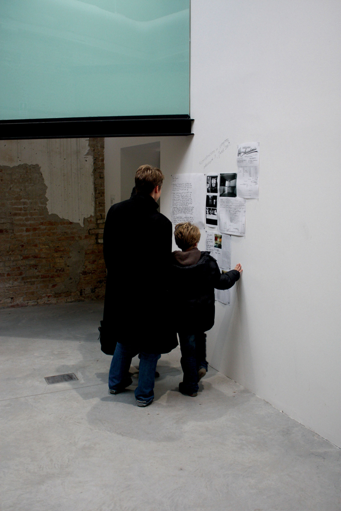
The installation height of the color photocopies, which seemed unusually low, stemmed from the height of the installer, a young boy, whose mother was director of the Biennale press office. Birnbaum saw inviting their participation as a tangible learning opportunity for the child.51 Additionally, I witnessed two occasions in which the reconstruction was applied as an elementary learning aid.52 This below-eye-level installation engaged a wider rotational range of eyes, neck, and body. The black-and-white photocopies at eye level were now lodged between variables of the “same” color.53 Negotiating the effects of the present color(s) in this way seemed to pragmatically calibrate the room into a questionable space.
I returned for the final two weeks of the Biennale in November, locating myself during exhibition hours in the room.54 I observed that, upon entering the room, around half the public would immediately utilize the document display as an orientation device. At this point, certain aspects, previously falling to the periphery, could be evaluated to enrich what was present.55
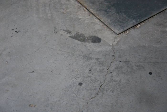
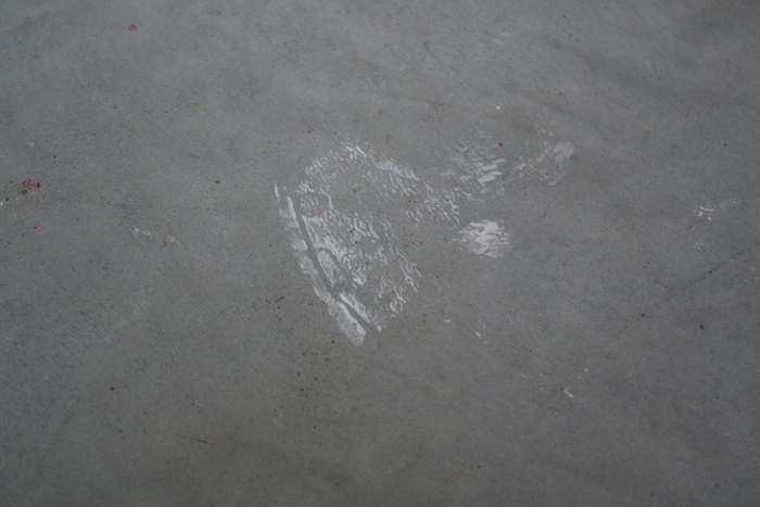
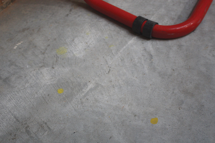
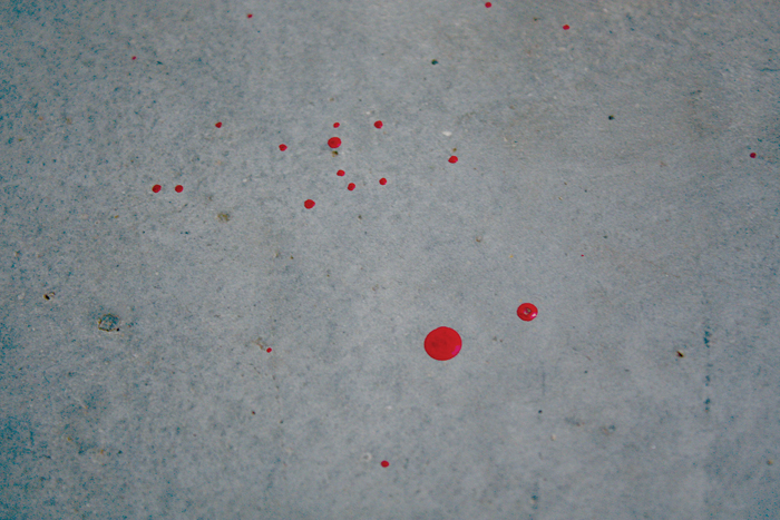
Numerous specks, drips, and splotches had dried on the floor and walls in each corner. “Blood spatter” in the red corner emphasized what was already a strange crime scene. In some places, there was evidence of attempts to cover up drips made while the paint was still wet, causing smearing behind one pane. These minute aspects become crucial to what the reconstruction attempt presents–to what was happening in this room, to what was constructed and what was unintentionally exhibited.56
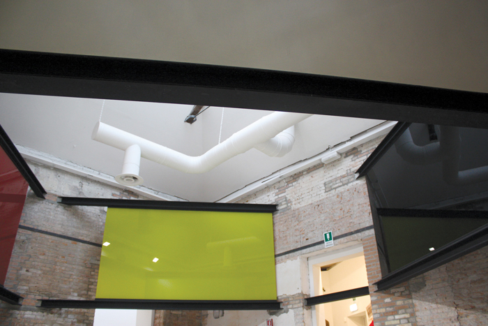
The quasi-mirroring agency of Himmelsrichtungen,57 activated more explicitly in Acht Grau, reflected not people in the room but the architecture, the arranged elements of the installation, and the skylight above.58 In 2009, a ventilation system now hung between the glass and the skylight.59
When I first met Birnbaum, he told me I was the first person to ask questions of him pertaining to the reconstruction on its own terms. Some scholars I’ve come in contact with, who are directly affiliated with Palermo’s work, had recognized an incongruous reconstruction. On two occasions, I was told that in the end the attempt to reconstruct outweighed issues in variance.
Upon entering the room in November, I immediately noticed two safety lights had been installed on the southwest wall, above and between the white and red panes. This is another instance in which health and safety codes were asserted. The reason given was that due to shorter and darker days, onsite Biennale personnel were prompted to add floodlights in the room to maintain a level of visibility. This addition occurred in mid-October, unbeknownst to the curators. The inclusion of interior light further ruptures and complicates the disorientation and distance from the 1976 construction. It prompted what I observe to be a third phase.
There was now a determined wall plane from which an angle of light was cutting across the space. The lights were on during exhibition hours,60 though there was sufficient natural light for most of this timeframe. Dusk was from 5:00 p.m. onwards; the intensity of the safety lights only amplified the uneven lighting of the room and reconstruction therein. One morning, all power went off in the building for a six-minute period. During that time the room was lit solely by November daylight. Although everyone in the room recognized the lights had gone off, no observable connection seemed to be made that these lights were an elementary contradiction in the first place.61
The lights amplified the crime scene. The white used to cover up drips was refracted. The harsh light revealed glossy brush marks on the wall, the same used on the white pane.
The beams, following the textual “black steel” description, had received a coat of black paint during installation.62 The black used seemed congruous with the pigment of the black pane. Had one of the four colors now been made present in every corner of the room, rather than in its designated one?
An evacuation plan was posted in the northeast doorway between the Rachel Harrison room and the reconstruction. Indicating the nearest exit paths in case of an emergency, it also marked due north as an arrow pointing to the top of the page. This incorrect disorientation of the building further supplanted the compass-like reorientation of the installation.
From the countless photographs taken by the public, only a handful have appeared on the Internet.63
There is word of another reconstruction returning to Barcelona, not within the span of a temporary exhibition, but permanently, a Celant initiative.66 If all reconstructive examples were laid out, a specific context of each would show five distinct orientations: Venice (H76), Barcelona (H02), London (H03), Venice (H09), and Barcelona (H_).
The point of curiosity and contention that I began to observe had developed from the very fact that an environment in which the colors were shifting was caused by the structure I was unavoidably viewing them through: a specific glass, brought on by contemporary safety codes, ultimately impacting the way in which the reconstruction constructed its own presence. The white paint succinctly exhibited the color of the glass.
While the glass in some capacity acts as a substrate for the painterly application of color, it was through its own interposed tint that the two alternated: the paint became a pseudo-substrate for the display of the glass color. The reconstruction, instead of returning the north, south, east, west alignment, or the German flag, actually brought emphasis back onto the architecture that supported it. The white of the one plaster wall was a ground not only for the “white” pane, but also the didactic, the document display, and the lights thereafter.
Neither this nor other discrepancies were initially addressed, even though didactic and documents had requested critical observance. This evasion was a contingency encouraged through a grayscale, black-and-white photo printout, copied book pages, and two invoices from an onsite archive. There was nothing, however, in this material that established a ground to enable the potential consideration of where “difference and repetition” was taking place. For example, why weren’t the contemporary invoices provided alongside the 1976 ones? I explored the option of finding these and having them added as well. After some delay, I asked contacts at the Biennale Foundation whether I could privately study them. I was told that this would be nearly impossible as the materials purchased for the reconstruction are buried within the general construction budget for the group exhibition, not in a separate art project budget, as the reconstruction was not an artwork.
In this case, was the artwork in the room at all? Through the formal didactic we are made aware it was destroyed in 1976, part of a previous Biennale exhibition, and now, we are presented with a reconstruction of something site-specific.67
“Site-specificity” as an artistic approach in the 1970s was not determined solely by location and geographical means, but was also situated by the temporality of the display. This is an aspect more readily forgotten as adopted styles, methods, and aesthetic tendencies grew out from the early instances. With the rise of adoption, recognition of the early practitioners’ imports built up in tandem to a desire on the part of exhibition spaces to receive a work that was specific to their site. What began as an objective tactic of rationalizing the particular infrastructures of an institution by means of confronting the physical, architectural spaces as catalyst, had morphed into institutions wanting to be in the spotlight of themselves. To have a site-specific work made on their grounds was taken to be a work made for them–specific becomes special–just for them and no one else: a glass slipper.68
The early examples of site-specificity were aware of the clock striking twelve and the vanishing process. The return of the exhibition space to its previous state was a necessary contingency. This acknowledgement seems almost relished, the magic and its ramifications all the more exhilarating and impressionable.69
H09 conforms to a present-day usage of site-specificity, in which the determined criteria for engagement are not limited to the existing characteristics of the space prior to the installment of the work. What is constituted not only involves research into the history and formation of the site through its characteristics, both exposed and underlying, but also into the history of previous examples deemed “site-specific,” which may aesthetically correspond to the proposed project. In other words, instances of site-specificity are now self-conscious acts, conscious of a history, which shapes the terms of production in a way that simply was not the case in 1976.
Inevitably, the reconstruction was of its time. That this reconstruction made mistakes is its very strength–in having been left to be mistaken, its weakness. If we squinted, we might feel like we were in 1976, or we might feel in some sense like we were in the artwork.
When I began opening my eyes, I found myself in 2009. The majority of what I have discussed tonight has been in relation to a variant in 1976 I never stood inside. If I observe that it doesn’t stay in the documents, but only inside the memory of someone who stood inside the space, what I have is not a derivative from 1976, but an example unto itself. What I have is what I did stand inside. Concurrently, it’s difficult when implications made in didactic, supplemental material, presented in situ, suggest a reconstruction directly observant of the past, inviting an engagement with something not present, physically or didactically.
Close-up view of mounted pane with yellow pigment, brush marks, foam buffer, glass cross-section with polyvinyl butyral interlayer and resulting effect through pane, primer and black pigment, yellow paint drips, layer of dust, and fingerprints on steel I-beam, November 2009. Photo: Adam Feldmeth.
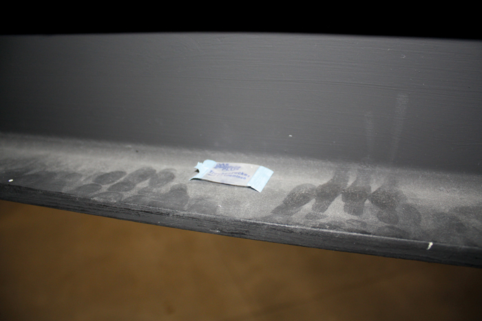
View of used sugar packet on ledge of painted I-beam with layer of dust and fingerprints, November 2009. Photo: Adam Feldmeth.
Installation view of southwest plaster wall with didactic, document display, white and red panes, reflected air ducts and safety lights, November 2009. Note: reflection of safety lights in red pane is a secondary reflection from the black pane. Photo: Adam Feldmeth.
In light of the 2009 reconstruction, it seemed vital that the color documentation was introduced into the space within the timeframe of the exhibition. It was the most minimal, logical way to continue, based on the arrangement already initiated by the curators. The first half of the exhibition presented a reconstruction only accurate by assumption; for the second half, the room became active as individuals began exploring its limits. The specific intent of the additions was to place emphasis on the reactivation of the educational capacity that Daniel Birnbaum had hoped this reconstruction, and the exhibition at large, could stimulate. Whereas the Knoebel show at the Neue Nationalgalerie had merely excluded the passing viewer from its internal arrangement, here the putative viewer initially saw everything, and nothing. The green glass was always in plain sight, yet only authorized university students were to be invited into the critical discussion, to enter the discursive field opened up by the reconstruction. The educational moment was postponed to a later date, after the exhibition closed, for a group who would engage the “reconstruction attempt” historically and re-constructively. This group of students led by an authorial educator never materialized. Yet, if learners were required, they were already there, within the crowds.
Adam Feldmeth lives and works in Los Angeles and Berlin.